
Setting up your Sitecore XMCloud Solution with Storybook and Storybook Testing Addons
- Authors

- Name
- David Goosem
Setting up a Sitecore XMCloud solution with Storybook and testing addons can significantly enhance your development workflow. This guide walks you through the process of integrating Storybook into your XMCloud solution, configuring testing addons, and ensuring seamless component development and testing.
Why Storybook for Sitecore XMCloud?
Storybook is a powerful tool for developing and testing UI components in isolation. When working with Sitecore XMCloud, Storybook allows you to:
- Build and test components independently of the Sitecore backend with mock data for nicer separation of concerns when testing.
- Create a living documentation for your components.
- Streamline collaboration between developers and designers.
Prerequisites
Before starting, ensure you have the following:
- A Sitecore XMCloud solution set up with NextJS.
- Node.js and npm installed on your machine.
- Basic knowledge of any CSS tooling you might be using (Eg. Tailwind or other if you're using it for styling).
Step 1: Installing Storybook
To add Storybook to your NextJS project, run the following command in your project directory (depending on your preference you might like to do set up storybook as it's own standalone "application" or include it into your existing application):
npx storybook@latest init
This command initializes Storybook and configures it for your NextJS project. Once the setup is complete, you can start Storybook with:
npm run storybook
Step 2: Configuring Storybook for Sitecore Components
I'd recommend to focus on a Solution Design that does not soley bake all your front end logic into Sitecore Renderings. I particularly love the Atomic Design approach. Building your solution this way means that you're set up for re-use and can do things like create Sitecore Rendering Variants with minimal duplication as you just import your component into your rendering and wrap it or pass in the data that you need. It also means you can import it into Storybook with mock data that lets us test and validate our UI externally to Sitecore.
This is best practice, especially when you consider reuse of your UI for other things like Sitecore Search or Sitecore Personalize where you want to achieve the same look and feel but without the Sitecore rendering wrapping code potentially (using Sitecore Search UI library or copying your componment over to Sitecore Personalize).
There are always going to be scenarios where you do want to have your entire Sitecore Rendering pulled into Storybook however. Whether that be to aid in page composition testing or due to the layering/nesting of elements being particulaly complicated for whatever reason.
To work with Sitecore XMCloud components, you'll need to configure Storybook to handle Sitecore-specific data structures. If you take a look in your Sitecore Layout file, we're going to be wrapping storybook up with mocks of these pieces (just the parts we absolutely need) so that the shape of the layoutservice data we get from our renderings will match correctly.
This will let us provide mocked versions of the standard layout service json data to our components.
Note: In your Storybook app, you will need to install the sitecore packages that we don't have already from the list of imports below**
We also need to create a the MockContextData.tsx file and populate it with the mock data we need to pass to the wrapping Sitecore pieces shown below.
Create a preview.js file in your .storybook directory (if not there already) and add the following:
// filepath: .storybook/preview.js
import React from 'react'
import { Preview } from '@storybook/react'
import { I18nProvider } from 'next-localization'
import { SitecoreContext, ComponentPropsContext } from '@sitecore-jss/sitecore-jss-nextjs'
import {
  mockComponentProps,
  mockComponentFactory,
  mockLayoutData,
  mockDictionary,
} from '../stories/MockContextData'

export const decorators = [
  (Story) => (
    <I18nProvider lngDict={mockDictionary} locale="en">
      <ComponentPropsContext value={mockComponentProps}>
        <SitecoreContext layoutData={mockLayoutData} componentFactory={mockComponentFactory}>
          <Story />
        </SitecoreContext>
      </ComponentPropsContext>
    </I18nProvider>
  ),
]
MockContextData.tsx
The Mock Context Data Looks like this
/* eslint-disable prettier/prettier */
import { Default as MegaMenu } from '@company/ui/src/components/navigation/MegaMenu';
import { Default as MobileNavigation } from '@company/ui/src/components/navigation/MobileNavigation';
import { Default as Breadcrumb } from '@company/ui/src/components/navigation/Breadcrumb';
import Heading from '@company/ui/src/components/common/Heading';
import { CTAButtonComponent } from '@company/ui/src/components/navigation/CTAButton';
import { MediaBannerCarouselNoStyleWatcher as MediaBannerCarousel } from '@company/ui/src/components/composite/MediaBannerCarousel';
import { MediaBannerCarouselItemNoStyleWatcher as MediaBannerCarouselItem } from '@company/ui/src/components/composite/MediaBannerCarouselItem';
import Richtext from '@company/ui/src/components/common/Richtext';
import { InPageAnchorLinksComponent } from '@company/ui/src/components/navigation/InPageAnchorLinks';
import { AccordionNoStyleWatcher as Accordion } from '@company/ui/src/components/composite/Accordion';
import { AccordionItemNoStyleWatcher as AccordionItem } from '@company/ui/src/components/composite/AccordionItem';

// eslint-disable-next-line @typescript-eslint/no-explicit-any
export const mockComponentFactory = function (componentName: string): any {
  const components = new Map();
  components.set('MegaMenu', MegaMenu);
  components.set('MobileNavigation', MobileNavigation);
  components.set('Breadcrumb', Breadcrumb);
  components.set('Heading', Heading);
  components.set('CTAButton', CTAButtonComponent);
  components.set('MediaBannerCarousel', MediaBannerCarousel);
  components.set('MediaBannerCarouselItem', MediaBannerCarouselItem);
  components.set('Richtext', Richtext);
  components.set('InPageAnchorLinks', InPageAnchorLinksComponent);
  components.set('Accordion', Accordion);
  components.set('AccordionItem', AccordionItem);


  const component = components.get(componentName);

  // check that component should be dynamically imported
  if (component?.element) {
    return component.element();
  }

  return component?.default || component;
};

//For getServerSideProps and getStaticProps
export const mockComponentProps = {};
export const mockLayoutData: any = {
  sitecore: {
    context: {
      pageEditing: false,
      isStorybook: true,
      site: {
        name: 'BrandSite',
      },
    },
    setContext: () => {
      // nothing
    },
    route: {
      itemId: 'edbe0b42-c76f-4759-9aa1-b5959971ab6e',
      name: '',
      placeholders: {},
    },
  },
};

export const mockRouter = {
  path: '/',
  asPath: '/',
  query: {
    id: '',
  },
  prefetch: () => undefined,
};

export const mockDictionary = {
  '/Components/Favourites/SaveItem': 'Save',
  '/Components/Favourites/RemoveItem': 'Remove',
};

//Corporate LayoutData
export const mockLayoutDataCorporate = {
  sitecore: {
    context: {
      pageEditing: false,
      site: {
        name: 'Corporate',
      },
      breadcrumb: {
        label: 'About Us',
        url: '/about-us',
        itemId: '0a82542e-34a3-4c6b-9ab2-8e10c21d3221',
      },

      siteSetting: {
        id: 'd01f3b9e-2381-4b29-82c2-085dcf79cf52',
        searchPageUrl: '/search',
        tagsPageUrl: '/tags',
        socialShareId: 'abc123',
        googleGTMId: 'UA-xxxxx-2',
        favouritesPageUrl: '/favourites',
      },
    },
    setContext: () => {
      // nothing
    },
    route: {
      itemId: 'edbe0b42-c76f-4759-9aa1-b5959971ab6e',
      name: '',
      placeholders: {},
    },
  },
};

export function getEditableContext(context = mockLayoutDataCorporate, pageEditing = false) {
  const clone = JSON.parse(JSON.stringify(context));
  clone.sitecore.context.pageEditing = pageEditing;
  return clone;
}
Let's dive into this file above...
Here you can see we have 2 examples of our MockLayoutData. mockLayoutData is the bare minimum you need while mockLayoutDataCorporate is an example of when you might have extended the layoutservice with some addional data for whatever reason you might have. Finally, there is an example of enabling the Edit Mode for sitecore if for any reason you wanted to set that up in Storybook. We're not currently using this much/at all but it's possible...
At the top of the file, you will see a series of Sitecore Compoonent imports and registrations for the componentFactory which we use. If you've followed any of my other articles about setting up multi-site/mono-repo solutions with Sitecore, you might be familiar with this already (see: Sitecore JSS Multi-Site with NPM Workspaces ) but this is how Sitecore registers all our components and marries them up to the Database Rendering Definitions in the solution.
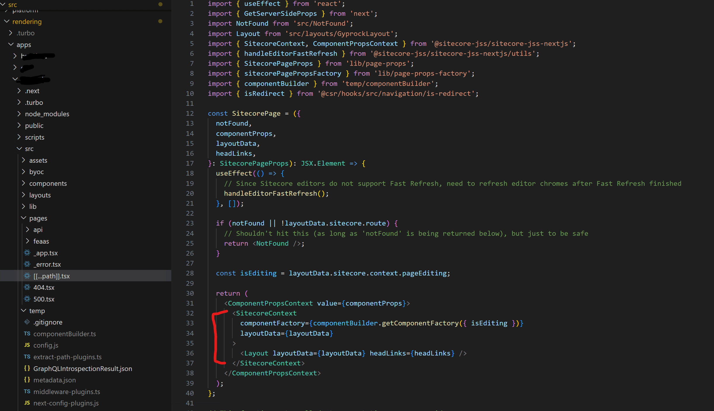
If we have rendering Variants, we can be specific about which variant we need etc. here. If you want to work out what to import, the Sitecore Generated file is generated as part of it's bootstraper start scripts and the output is in your app folder within /src/temp/componentBuilder.ts (see my linked article above for more detail). We're mimicing the output of the Sitecore Boostrapper scripts ourselves to pass to our Mock Component Factory so that our Sitecore Components will work.
// (look for these lines in the sample code above for ane example)
import { CTAButtonComponent } from '@company/ui/src/components/navigation/CTAButton'; components.set('CTAButton', CTAButtonComponent);
Now we have all the data we need to pass to the Wrappers we added around the Storybook Preview <Story /> node above.
This ensures that your components render correctly in Storybook as long you're providing your mock data in the correct fashion.
Mock Data Concepts for Sitecore Components in Storybook
Note: If you have a Rendering which doesn't contain nested placeholders and placeholder data, and you're only presenting it in isolation within Storybook, you won't need to configure the mock registration for those usages and you don't really need to do much more than just set up your mock data to satisfy your props.
You only need to register the Sitecore renderings/components if you're creating Stories with nested Renderings within placeholders.
I typcially work using a Sitecore-first approach for setting up data templates/placeholders and things to verify my thinking. This is a good opportunity to lay things out and confirm the Sitecore Authoring Experience is the best it can be while still in a "white site" phase
Step 3: Adding Storybook Testing Addons
Storybook testing addons, such as @storybook/addon-interactions and @storybook/testing-library, allow you to write and run tests directly in Storybook.
Install the addons:
npm install @storybook/addon-interactions @storybook/testing-library --save-dev
Update your .storybook/main.js file to include the addons you need:
// filepath: .storybook/main.js
module.exports = {
  addons: [
    '@storybook/addon-links',
    '@storybook/addon-essentials',
    '@storybook/addon-interactions',
  ],
}
Step 4: Writing Stories for Your Components
Let's take a look at our breadcrumbs navigational component as our example here as we're looking specifically at Storybook with Sitecore Renderings. This is a Sitecore Rendering in which we have some presentation logic which we need to consider whereby we want to display an epllipsis in the middle of the breadcrumbs when we have 4 or more navigation items to display. In order to help us understand the component, I therefor want 2 stories to cover this. One I will pass in only a few navigation items and the other I'll use significantly more items so we can present and test the 2 scenarios we care about here.
The output of my stories will look like this:
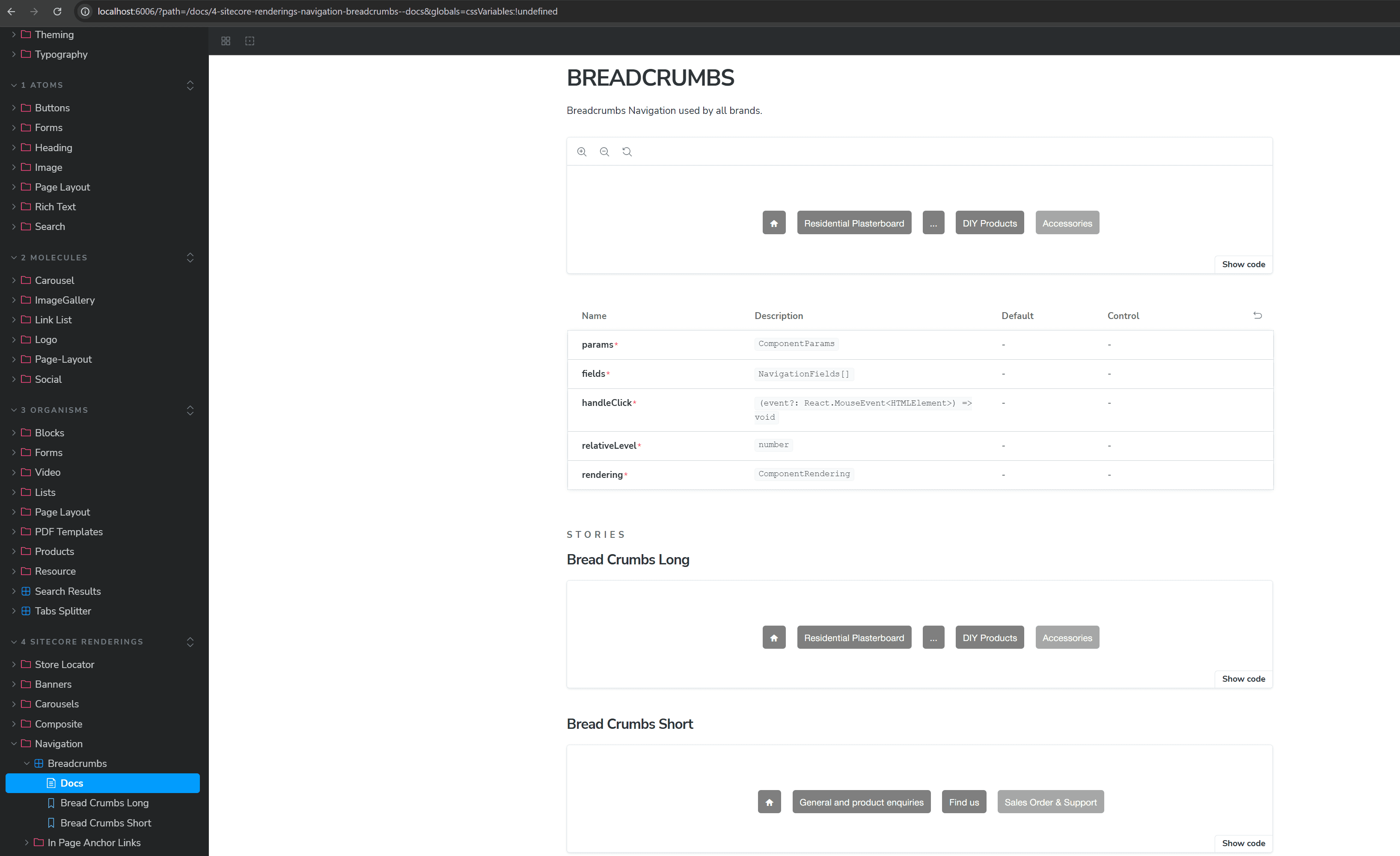
We can see I've got the breadcrumbs in the mock registration above, so now my stories are as simple as importing the the mock data (you can see here i'm just recycling some mega menu data we already had) and i've picked a node from that to use by setting them up with the right number of path items to satisfy the 2 scenarios..
import type { Meta, StoryObj } from '@storybook/react';
import { Default as Breadcrumbs } from '@brand/ui/src/components/navigation/Breadcrumb';
import React from 'react';
import { MegaMenuData, defaultRenderingData } from './Navigation-data';
import { expect } from '@storybook/test';

// More on how to set up stories at: https://storybook.js.org/docs/writing-stories#default-export
const meta: Meta<typeof Breadcrumbs> = {
  title: '4 Sitecore Renderings/Navigation/Breadcrumbs',
  component: Breadcrumbs,
  parameters: {
    docs: {
      description: {
        component: 'Breadcrumbs Navigation used by all brands.',
      },
    },
    backgrounds: { default: 'Light' },
    layout: 'centered',
  },
  tags: ['autodocs'],
  args: {},
} satisfies Meta<typeof Breadcrumbs>;

export default meta;

type Story = StoryObj<typeof Breadcrumbs>;

// More on writing stories with args: https://storybook.js.org/docs/writing-stories/args
export const BreadCrumbsLong: Story = {
  args: {},
  render: () => {
    return (
      <Breadcrumbs
        fields={MegaMenuData.fields[1].Children || []}
        handleClick={MegaMenuData.handleClick}
        rendering={defaultRenderingData.RenderingWithDatasource.rendering}
        relativeLevel={MegaMenuData.relativeLevel}
        params={MegaMenuData.params || {}}
      />
    );
  },
  play: async ({ canvasElement }) => {
    //check to confirm the ellipsis item is presented in the breadcrumbs
    const breadcrumbEllipsis = canvasElement.querySelector('.breadcrumb-ellipsis');
    expect(breadcrumbEllipsis).toBeInTheDocument();

    // confirm the breadcrumb home item is present and uses the home icon presented
    const homeIcon = canvasElement.querySelector('.brand-icon-font-homerounded');
    expect(homeIcon).toBeInTheDocument();

    //confirm the number of breadcrumb items is exactly 5 as we have more than 5 in the list and we're formatting it to present only 5 including the ellipsis
    const breadcrumbItems = canvasElement.querySelectorAll('.breadcrumbs-item');
    expect(breadcrumbItems.length).toEqual(5);
  },
};

export const BreadCrumbsShort: Story = {
  args: {},
  render: () => {
    return (
      <Breadcrumbs
        fields={MegaMenuData.fields[4].Children?.slice(0, 3) || []}
        handleClick={MegaMenuData.handleClick}
        rendering={defaultRenderingData.RenderingWithDatasource.rendering}
        relativeLevel={MegaMenuData.relativeLevel}
        params={MegaMenuData.params || {}}
      />
    );
  },
  play: async ({ canvasElement }) => {
    // confirm the breadcrumb home item is present and uses the home icon presented
    const homeIcon = canvasElement.querySelector('.brand-icon-font-homerounded');
    expect(homeIcon).toBeInTheDocument();

    //check to confirm the ellipsis item is not presented in the breadcrumbs as we have 3 or fewer items
    const breadcrumbEllipsis = canvasElement.querySelector('.breadcrumb-ellipsis');
    expect(breadcrumbEllipsis).not.toBeInTheDocument();

    //confirm the number of breadcrumb items is less or equal to 4
    const breadcrumbItems = canvasElement.querySelectorAll('.breadcrumbs-item');
    expect(breadcrumbItems.length).toBeLessThanOrEqual(4);
  },
};
Step 5: Adding Unit Tests
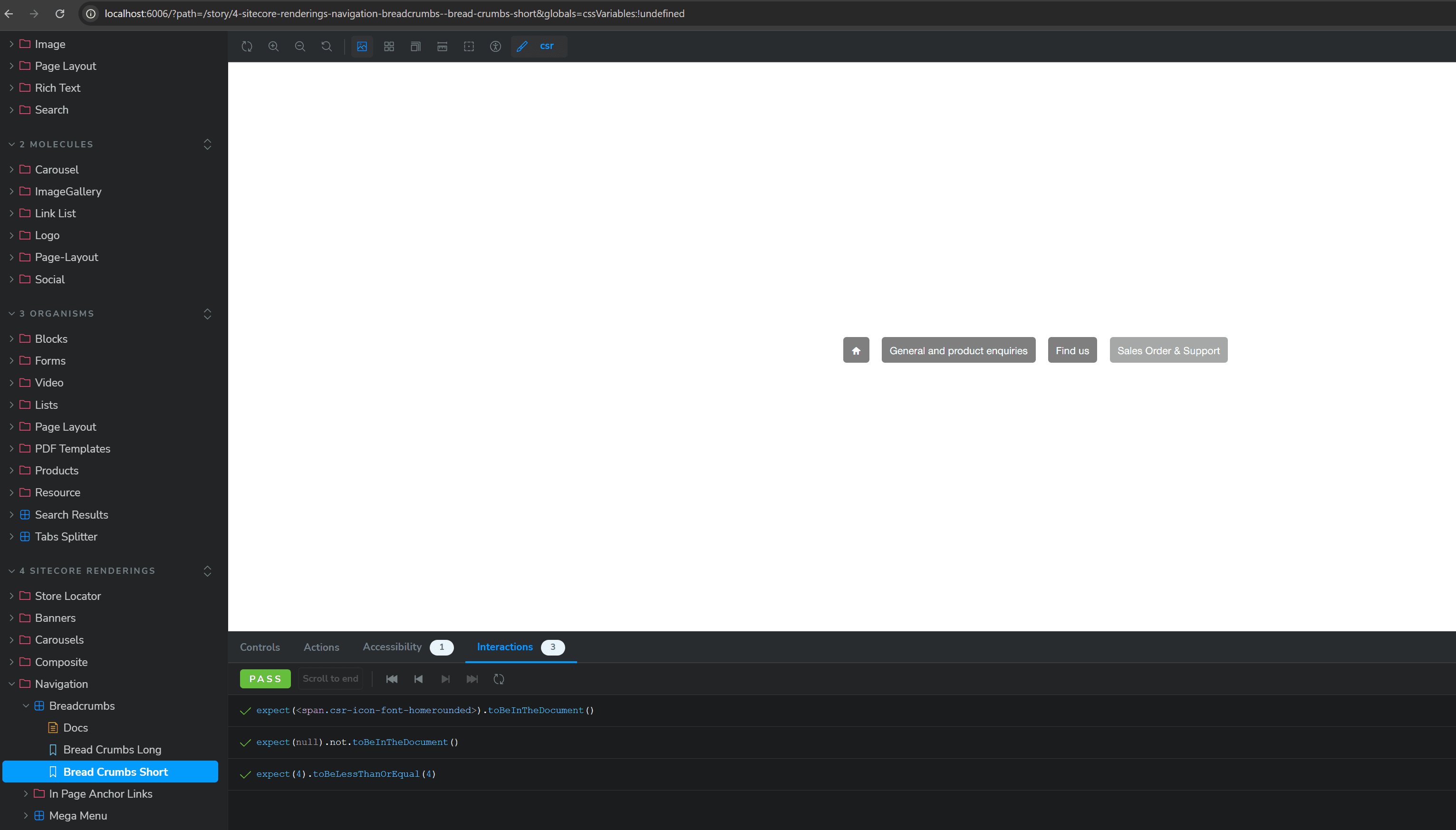
You may have already picked it up in the sample code above for our Breadcrumbs but it's possible to utilise Storybook to manage our Unit Tests and make use of our existing DOM created for Storybook. When you set up traditional JEST unit testing you need to 'create' a virtual DOM to allow us to then traverse and locate elements and test against and provide Mock Data and context etc to.
Given we already have this with Storybook, it makes a lot of sense to use this and just layer unit tests on top. Happily this is very possible and this is what the purpose of the additional Storybook Addons we installed in Step 3 above.
Let's look at the Sample stories above for the Breadcrumbs. You can see that there is a "play:" section below our "render:" section and this is where the unit testing happens. We've got the ability to use the canvas/DOM that is on the page and traverse our Storybook DOM to write tests against.
You can see we have imported "expect" from storybook/test and we're using this with some nice library of comparision tooling.
This will then do some pretty neat stuff where we can see the output of our tests within storybook while it's running via the Interactions Tab (see below). This lets us step through the tests and re-run them as we make changes live for immediate feedback!
We can still run our tests as its own task if we want to (say for a CI check in Github or whatever pipeline tooling you're using so you can run unit tests on PR's as part of your review process using:
npm run test-storybook
We'll do a deeper dive into this in another article but this gets you well on your way to having your solution set up with Storybook and Unit Testing.