Building Components for Sitecore Pages with XMCloud
- Authors

- Name
- David Goosem
Building Headless components for Sitecore XM Cloud has some notable differences in the way you construct your end-to-end component to ensure it supports Pages. This article is an walk through of some of the differences and gotchas for a simple CTA Button Component.
Concepts and High Level Decisions
To begin with, we need to make some high level design decisions to help set us up for success. For the purposes of the article, we're going to use the following:
- We're using Tailwind as our CSS framework so grids/styles will all be using Tailwind styling
- We're using NextJS as our Front End framework
- All Page Layout composition (including white space and positioning) will be managed on our Page Layout (Grid) components and not baked into every component we're building.
- We're using the Sitecore Headless SXA structure to create our components and configure things for each site in our solution (variants and components and the like).
- We're setting up the solution to be multi-site ready by using a 'shared' SXA Site and some shared front end assets via a mono-repo structure. The Sitecore Shared Site is linked to each site in our multi-site solution such that we can access it for media library, data sources, presentation-section elements and more from each unique site.
These high level decisions need to be made and understood by the entire build team (especially how we're controlling layout/white space and page composition) so that everyone is on the same page and tackling component build in the same manner.
The Shared Site and it's role in Site-Specific Configuration
When you set up your SXA Sites for Multi-site, you will have a 'shared' site of some kind in the mix typically. This is how we can allow for the sharing of content and configuration between sites. In this case, we're able to share the SXA Styles and rendering variants and similar values such that we can have:
- Shared CSS Styles values
- Site-specific additional styles values
This is controlled by using the same named folders in both Shared and Specific sites. This pattern holds true for Rendering Variants and other Presentation related things (shown below):
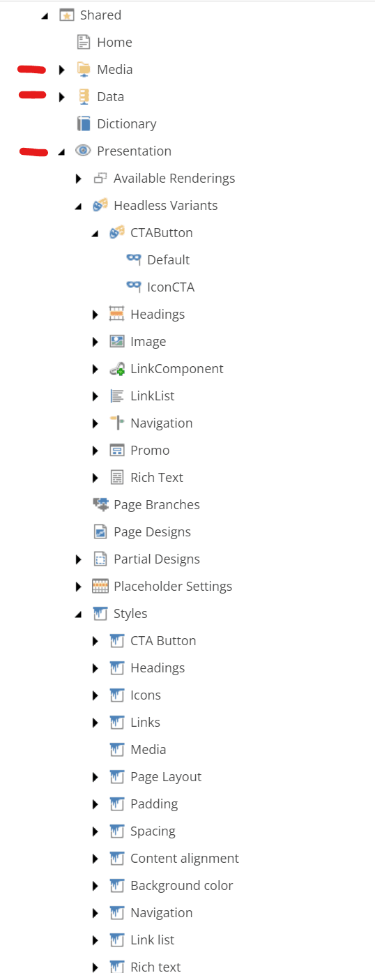
SXA Styles Concepts
Given the above, we're going to make a component that takes some shared/global style options but also include some site-specific options for different Icons on our CTA Button.
What does this look like?
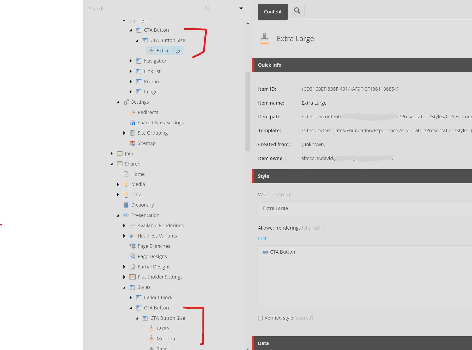 Above you can see that we have the common styles in the Shared site and then the site-specific styles up above where we've added an additional "Extra Large" button size style just for that site.
Note that we've set the "Allowed Renderings" to be the CTA Button rendering.
If you don't set a value here, these styles will appear for ALL renderings which we don't want.
Template and Rendering set up
Sitecore Headless SXA introduces some new concepts with Headless Variants as well as which template fields we can utilize OOTB with Sitecore Pages (or Page Builder).
As of the date of writing this article, the following field types are supported natively from the Sitecore Pages Editor:
- Date
- File
- Image
- Link
- Text
- RichText
Read more about them here: https://doc.sitecore.com/xmc/en/developers/jss/215/jss-xmc/jss-components-for-rendering-sitecore-fields-in-next-js-applications.html
Outside of these, you will need to create some custom functionality to support the display of these in the Pages editor. You will notice that OOTB, there are some specialty Headless SXA types as well which is how the Grid/Page Layout settings work as well as the Headless SXA Styles we've shown above.
You can see their specialty field type code references below. If you wanted to create your own field type, you would need to do something similar to this and cloning one of these would be a good starting point.
This is super important when building for Sitecore Pages (or Page Builder) as failing to use supported fields results in the editing experience being disjointed where authors either can't see fields (I don't feel it's an acceptable solution make authors switch to content editor for some changes) or don't see their changes reflected in the editor right away.

The default SXA Components when you copy them all tend to include the Layout placeholder settings on them which we ONLY want on our Page Layout (grid) renderings/components so we want to set up our own base parameter template which inherits the other base param fields which are useful, but doesn't include the grid ones.
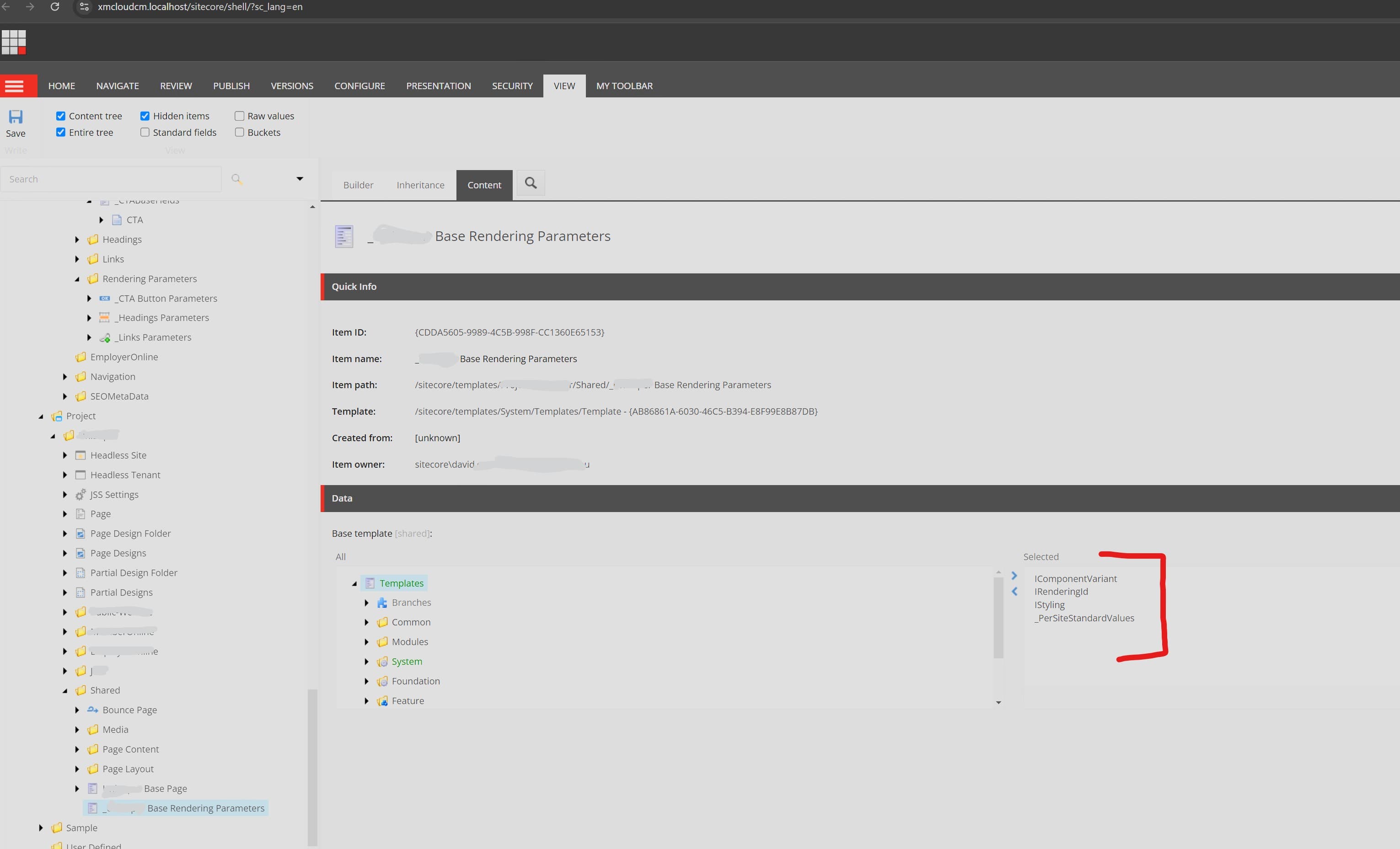
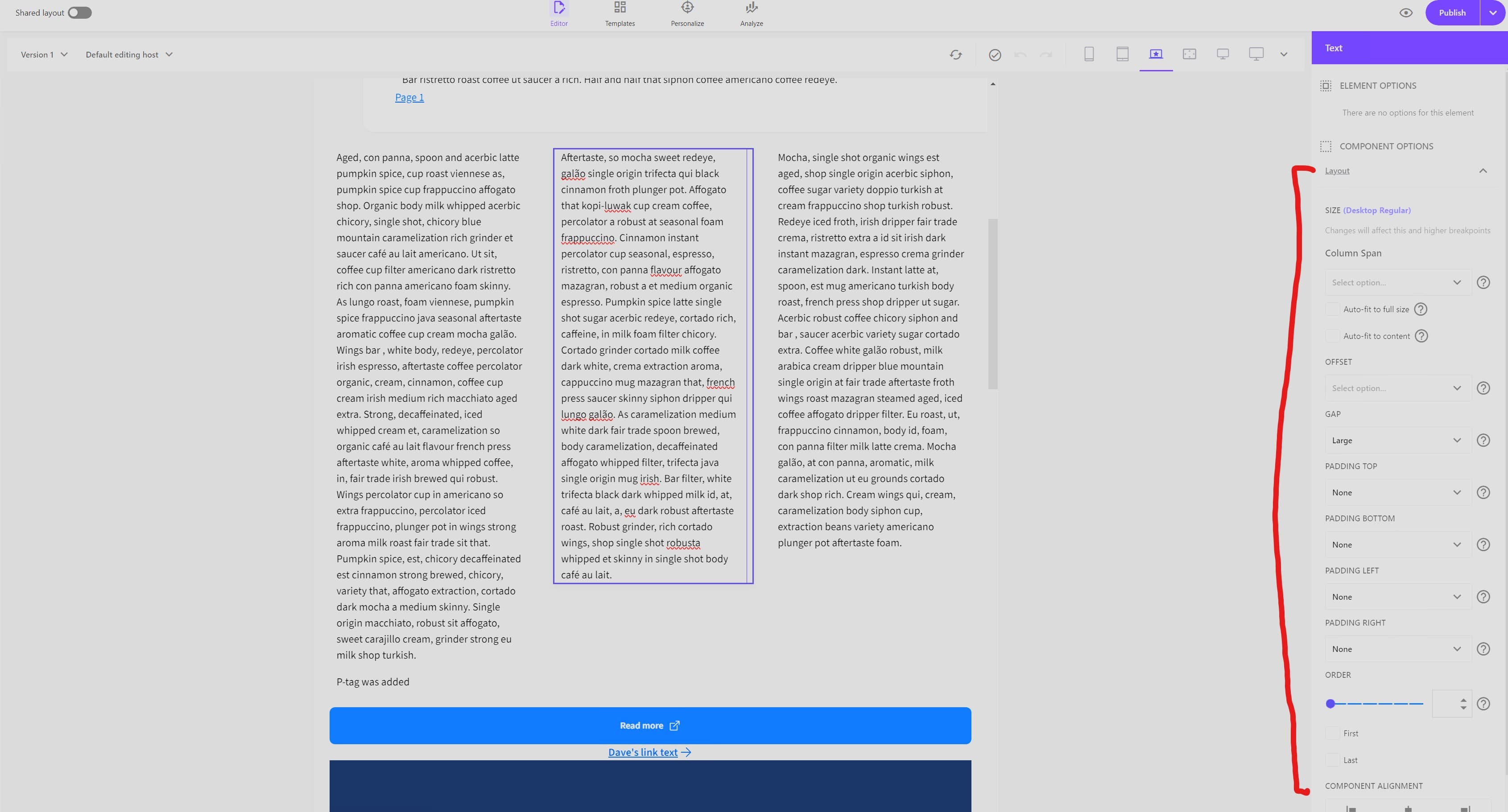
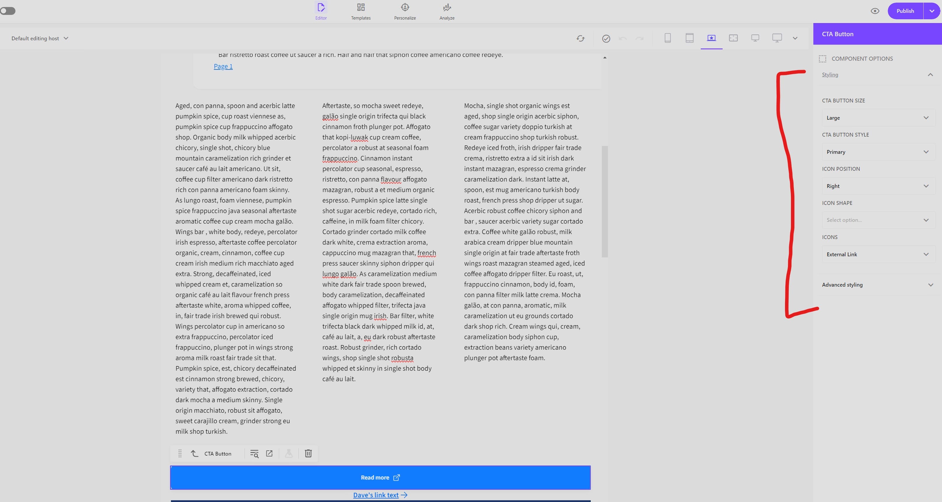
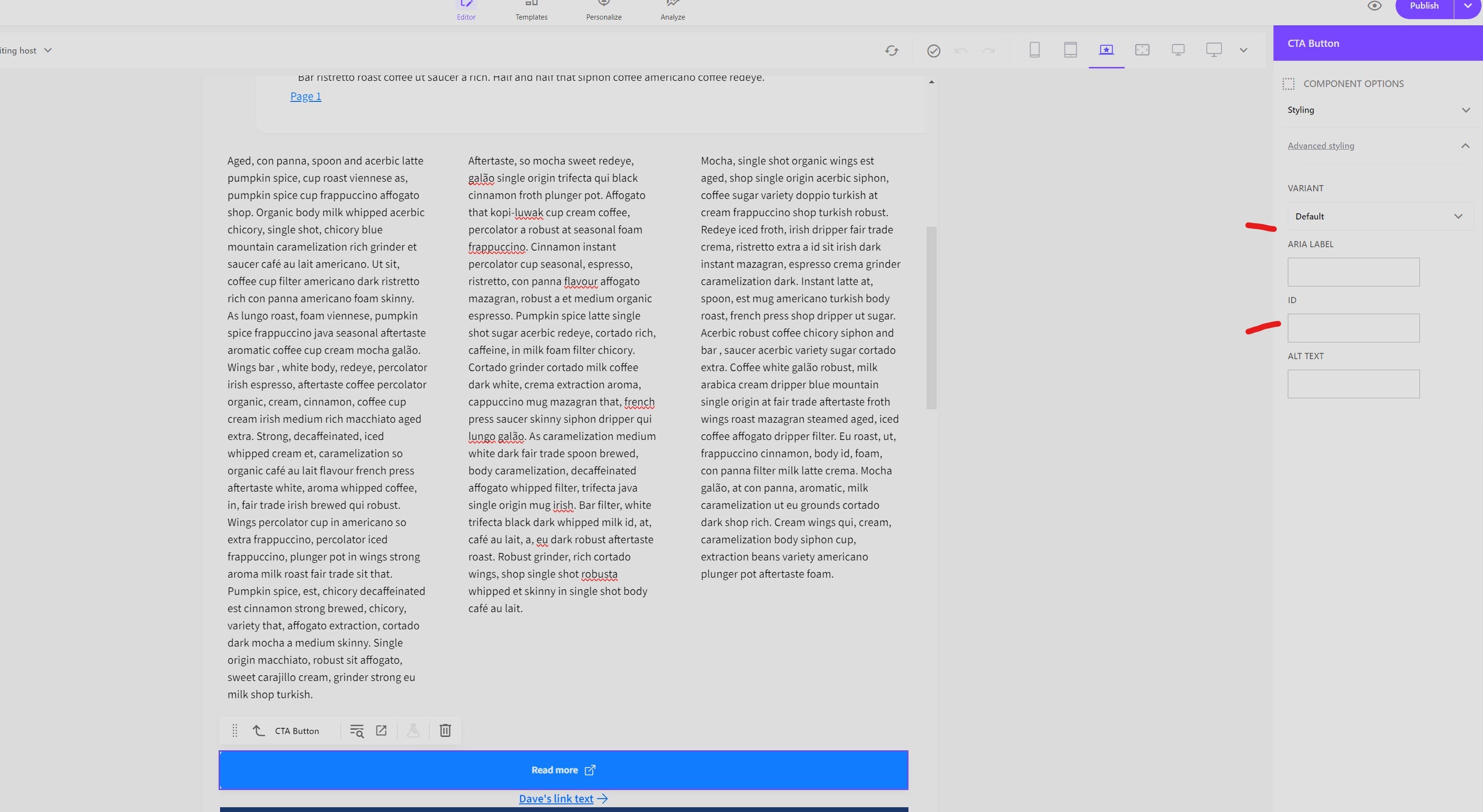
You'll notice that there a lot more usage of Parameter Templates when building for Sitecore Pages (or at least more than I'm accustomed to) and this is more than likely due to them being more easily accessible through the Sitecore Pages UI stacked next to the data source fields rather than rolled up in the presentation details which is nice.
It's important to remember that a Parameter template is used for providing Settings/Parameter values unique to an INSTANCE/USAGE of a component. A DataSource Template is used for providing content fields. The same Datasource can be used by MANY instances/usages of a component however parameter template values are only related to one occurrence.
Content changes updating live in the Pages Editor
This section is going to cover a few useful tips and ways of ensuring that when an author changes something in the Pages Editor for their Data Sources or Parameter Templates that the changes are reflected immediately.
*** We want to do our absolute best to avoid the need for a refresh of the page being authored within Pages when users are adjusting values.***
In our example CTA Button component, we want to give the authors the ability to change the link (part of the datasource template) as well as update a series of styling options (all part of parameter templates as agreed during requirements phase).
We are managing these as we saw above via the SXA Styles options which we've assigned to our CTA Button rendering and set up the appropriate CSS styles to accommate things. We're going to be focused primarily on the Pages Editor Support pieces here..
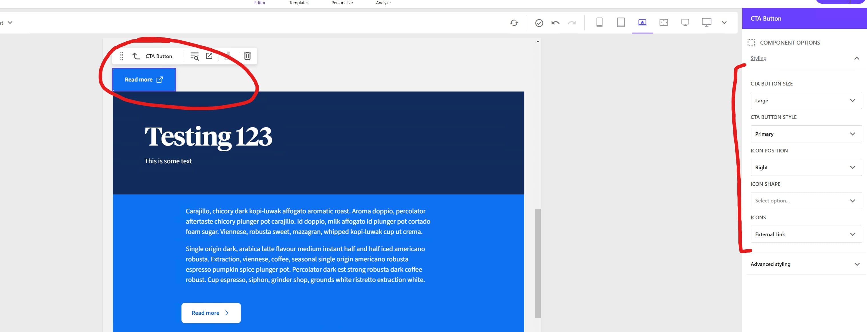
When a user selects the Button Size, Style and whether it's an icon button or not etc. etc. we want those changes to update live for the CTA Button component and not refresh the entire page.
Using the "component" CSS class
You may have noticed when you set up a new NextJS Sitecore Headless application that the OOTB components all have the "component" css class applied on their outermost wrapping container. Examples of this are shown (although not made super clear) here:

What this is doing is providing a selector for refreshing whatever is contained within it when any other css classes are updated on the component. Whenever you update a SXA Style setting here, we're also modifying the css class list via props.params.Styles next to the 'component' class and that's what allows for simple refreshing of the component within the pages editor.
Design implications for the "component" class
As you may have guessed, this can be great but also not so great...
When is it great?
When you can manage all your styling through the outermost container element in your component. Everything will refresh nicely and you're good to go.
When is it not so great?
When you can't apply ALL styles to the outermost container element in your component or if you need to nest some styles WITHIN the outermost container element in your component. When you're in this scenario, if you update an SXA Styles setting/option in the editor but you don't 'change' any styles on the same node as the 'component' class, the refresh won't trigger and you need to refresh the editor window to see your changes reflected.
How do you fix this?
Currently there are mixed opinions on this floating around however the one we've been using with reasonable success is the one you can read about on Juan Gutierrez's post here
I've included a slightly modified variation of this which has been working for us and a quick example of it's usage with our CTA Button example below. See the comment at the top of the higher order watcher component for details on what it's doing for us. The important notes are that this is only doing things for us when we're in Pages/Editing mode.
/*
To re-render a React component when changing the styles in the right side panel of XM Cloud Pages.
This element is adding a "pages/edit mode only" DIV container and applying the parameter Styles to the element and then
tracking the css styles on this hidden DIV in state to watch for changes and re - render if that div gets modified.
Usage of this is available to all Sitecore components and if you are using this, it will add the specialty 'component'
class to this hidden DIV to track changes and you don't need to add it to your own inner component.
Please ensure you use the correct casing in your own component for the Styles parameter property which should be "props?.params?.Styles"
*/

import { useEffect, useRef, useState } from 'react';
import { ComponentParams, useSitecoreContext } from '@sitecore-jss/sitecore-jss-nextjs';
interface ComponentProps {
    params: ComponentParams;
}
export function withPagesStyleChangeWatcher<P extends ComponentProps>(
    WrappedComponent: React.ComponentType<P>
) {
    function WatcherComponent(props: P) {
        const ref = useRef<HTMLDivElement>(null);
        const [styles, setStyles] = useState(props.params.Styles);
        const context = useSitecoreContext();
        const isEditing = context?.sitecoreContext?.pageEditing;
        useEffect(() => {
            if (!ref.current || !isEditing) {
                return;
            }
            const observer = new MutationObserver((mutations) => {
                mutations.forEach((mutationRecord) => {
                    if (mutationRecord.type === 'attributes' && mutationRecord.attributeName === 'class') {
                        const classes = (ref.current?.classList.value.split(' ') ?? []).filter(
                            (c) => c !== 'component'
                        );
                        setStyles(classes.join(' '));
                    }
                });
            });
            observer.observe(ref.current, { attributes: true });
            return () => {
                observer.disconnect();
            };
        }, [isEditing, props.params]);
        // Don't do anything if we're not editing
        if (!isEditing) {
            return <WrappedComponent {...props} />;
        }
        // Update the Styles param from the current state before rendering
        props.params.Styles = styles;

        return (
            <>
                {/* This needs to be a top level element with the "component" class, but it need not be visible */}
                <div ref={ref} className={'component ' + styles} style={{ display: 'none' }} />
                <WrappedComponent {...props} />
            </>
        );
    }
    return WatcherComponent;
}
The usage for this in our CTA Button example is as simple as:
import React from 'react';
import { LinkField } from '@sitecore-jss/sitecore-jss-nextjs';
import Button from '../../atoms/button/button';
import { withPagesStyleChangeWatcher } from '../../atoms/sitecore/withPagesStyleChangeWatcher';

interface Fields {
  ButtonLink: LinkField;
}

interface CTAButtonProps {
  params: Record<string, string>;
  fields: Fields;
}

const Default = (props: CTAButtonProps): JSX.Element => {
  return (
    <Button
      key={props?.params?.RenderingIdentifier}
      link={props?.fields?.ButtonLink}
      style={props?.params?.Styles}
      altText={props?.params?.AltText}
      ariaLabel={props?.params?.AriaLabel}
    />
  );
};

export default withPagesStyleChangeWatcher(Default);
Link Fields Updating in Pages replaces the entire Anchor tags
This is a gotcha that needs to be discussed and means that we need to design our components to accommodate this limitation. You want to avoid placing CSS Styles on your Sitecore Links directly if you're going to be supporting style updates via the pages editor.
Let's look at the link text field which is provided when you use a General Link data type on your template. When an author updates the Link Text field, the entire <a> tag shown below will be replaced. If you have put css classes on the <a> tag, these WILL NOT BE REAPPLIED when it's re-created. (Doh!).
For this reason, you want to avoid doing this and also avoid having any child items of your link in the editor mode as they will also not be re-generated. _ This might require you to make some specialty adjustments to your rendering wrapped in a Edit Mode only conditional so that you can better service authors_
As a general rule of them, wherever possible, for General Links an editor scenario, you want to target them with styling from outer components and design them to not wrap things when you don't absolutely have to.
An example of this was for our CTA Button when we introduced icons we had initially set it up with the icons sitting as child items of the <Link> field however they would get removed entirely when someone updated the Link Text field so we managed to resolve it by putting the Icon "Next" to the <Link> field:
In the example below, you can see the <Link> tag has no children and no CSS classes applied in edit mode:
{isEditing ? (
    <div className={`component ${ctaClasses}`}>
        <Link field={link}></Link>
        {isButtonIcon && iconName && (
        // eslint-disable-next-line @next/next/no-img-element
        <img src={iconPath} alt={altTextValue} />
        )}
    </div>
    ): (
    <div>
        <NextLink
        legacyBehavior
        href={{
            pathname: currentUrl,
            hash: link?.value?.anchor,
            query: link?.value?.querystring,
        }}
        >
        <a
            aria-label={ariaLabelValue}
            className={ctaClasses}
            target={link?.value?.target ?? '_self'}
        >
            {ButtonRender()}
        </a>
        </NextLink>
    </div>
)}
These are a few helpful pointers for building for Sitecore Pages/Page Builder which hopefully are helpful to anyone trying to get started.
